The Challenge
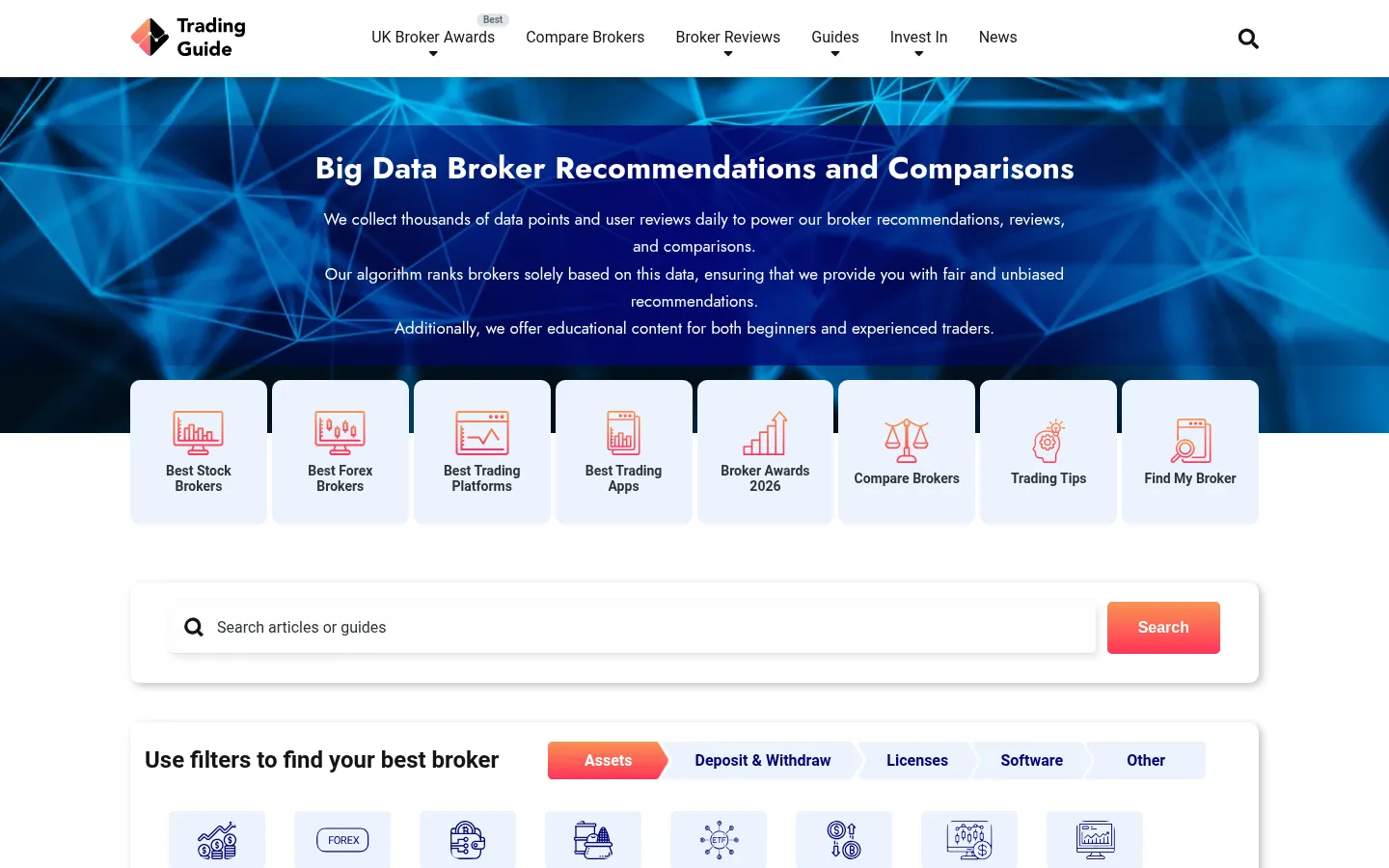
TradingGuide.co.uk is a UK-based financial education and resources platform providing traders and investors with broker reviews, market analysis tools, and educational content. The UK financial information market is heavily saturated and deeply sceptical — audiences have spent years encountering low-quality "trading signal" sites, misleading broker reviews, and clickbait financial content that prioritises affiliate commissions over accuracy.
The core challenge of financial education website design in this environment is establishing credibility before the content is even read. The design, structure, and tone of the platform must signal — immediately and unambiguously — that this is a source of genuine value rather than another affiliate link farm dressed as editorial content. In a category where trust is the only differentiator, the website itself is the first piece of evidence the audience evaluates.
The platform also needed to serve two meaningfully different user groups: beginner investors who need clear, accessible explanations and structured learning paths; and experienced traders who need depth, data, and comparative broker analysis without being talked down to. Designing for both simultaneously without alienating either is a genuine information architecture challenge.
The Strategy
- Trust-forward design system — developed a visual language that communicates financial seriousness: structured layouts, restrained colour palette, editorial typography, and an absence of the visual noise that signals low-quality financial content to a sceptical audience
- Dual-audience information architecture — structured the platform with clear entry points for beginners (educational guides, explainer series, glossary) and for experienced traders (broker comparison tables, market data, advanced strategy content), with intuitive cross-navigation between both
- Broker review UX design — built a structured review format with consistent evaluation criteria, transparent methodology disclosure, and comparative data tables that give the audience the information they need to evaluate brokers independently rather than simply accepting a recommendation
- Responsive design for cross-device trading research — designed every section of the platform for seamless performance on desktop (where detailed research happens), tablet (where reading happens), and mobile (where quick reference and market checks happen during trading sessions)
- WordPress CMS for editorial velocity — implemented a content management system that allows the editorial team to publish time-sensitive market commentary, update broker reviews as conditions change, and expand the educational library without developer involvement
- Financial services SEO architecture — built a keyword-optimised URL structure, implemented structured data for Review and Article content types, and established internal linking patterns that build topical authority in trading and investment information categories
The Results
Why this matters
Financial information is a YMYL category — Google applies the same elevated quality standards to trading education as it does to medical and legal content. A trading platform website design that does not meet E-E-A-T standards will not rank competitively for the high-value queries where financial audiences search. The design work and content architecture must work together to signal quality to both human readers and search quality raters.
Financial education website design is not about making a site look professional — it is about making the audience feel safe trusting the information it contains. In a category saturated with low-quality content, a platform that visually and structurally communicates genuine editorial rigour converts readers into loyal audiences at a rate that no amount of SEO alone can replicate.
The broker review format was the most strategically important individual design decision on the project. Broker reviews are the highest-value content type on a trading education platform — they attract high-intent search traffic and generate significant affiliate revenue when done with genuine editorial independence. A format that appears objective but isn't will be identified and dismissed by the experienced trader audience TradingGuide serves. Building transparency into the format from the design level was not a nicety — it was commercial strategy.
If you are building a financial education website design, an investment resources platform, or any financial services website that needs to earn trust in a sceptical category, TradingGuide.co.uk demonstrates what a design-led, architecture-first approach delivers.