The Challenge
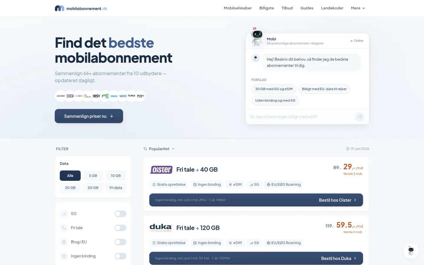
Mobilabonnement.dk is a Danish mobile plan comparison platform helping consumers navigate a crowded telecom market to find the subscription that best matches their data usage, budget, and provider preferences. When the project came to Mettevo, the site's core problem was structural: a cluttered, information-heavy interface was overwhelming visitors rather than helping them, producing a high bounce rate that no amount of traffic would convert into comparison completions.
The core challenge of telecom comparison website design is the paradox of choice problem applied to a category that users care about but find genuinely confusing. Danish mobile tariffs involve combinations of data limits, speed caps, roaming inclusions, binding periods, and promotional pricing that are legitimately difficult to compare without a well-structured tool. A platform that presents all of this information simultaneously without filtering or hierarchy makes the user's decision harder, not easier — and they leave.
The data freshness problem was a distinct technical challenge. Telecom operators update tariffs frequently — new promotional offers, changed data allowances, price adjustments — and a comparison platform that serves outdated information loses user trust immediately when the price they find on the platform doesn't match the price they find when they click through to a provider. The database architecture needed to handle continuous updates without requiring manual editorial intervention for every tariff change.
The Strategy
- Custom WordPress theme development built specifically for comparison platform requirements — not a generic theme adapted for comparison use, but a purpose-built design system that treated filtering, ranking, and comparison as primary UI functions rather than secondary features
- Advanced tariff filter UX — designed a multi-parameter filtering system allowing users to specify data allowance, monthly budget, binding period, and network preference in a single intuitive interface that narrows results progressively rather than displaying a static list of all plans simultaneously
- Automated database with live offer updates — implemented a database architecture with automated scraping and API connections to keep tariff information current without manual editorial intervention, ensuring users always compare real, available offers at actual current prices
- Interactive UI elements and animations — introduced micro-interactions and progressive loading states that make the comparison experience feel responsive and purposeful rather than static, keeping users engaged through the filtering and decision process
- Mobile-first responsive design — rebuilt the entire comparison interface for smartphone-first interaction, recognising that a significant proportion of Danish mobile plan research happens on mobile, often at the point where a user is reconsidering their current contract
- Nordic SEO architecture — built a keyword-targeted Danish-language URL structure, implemented structured data for product comparison content, and developed a content strategy targeting the specific mobile plan and telecom comparison queries the Danish market uses
The Results
Why this matters
Comparison platforms in competitive consumer categories like telecoms are only commercially viable if users trust the data they find there. A platform that shows outdated prices, missing plans, or inaccurate data limits will be visited once and never returned to — and in the Danish market, where users are sophisticated consumers with multiple comparison options, that trust deficit is fatal. Mobile plan comparison website architecture must treat data accuracy as a first-class engineering requirement, not an editorial responsibility.
Telecom comparison website design is fundamentally a UX problem masquerading as an information problem. Users don't struggle with telecom comparisons because they lack information — they struggle because the information is presented in a way that makes comparison cognitively expensive. The platform that removes that cognitive cost, rather than adding to it, earns and keeps its audience.
The automated database architecture was the decision that determined whether Mobilabonnement.dk could operate as a sustainable business rather than a high-maintenance editorial operation. Manual tariff updates require constant human attention to a process that scales poorly as the number of providers and plans grows. Automation at the data layer means the editorial team can focus on comparison content strategy rather than data entry — a structural advantage that compounds as the platform grows.
If you are building a broadband comparison website development project, a telecom comparison tool, or any utility comparison platform in a Nordic or European market, Mobilabonnement.dk demonstrates the filter UX and database architecture that comparison platforms need to compete.